
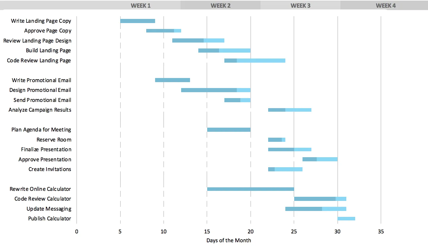

If you’ve never built a Gantt chart before, Excel is often the go-to starting point. It’s software you already know, with plenty of flexibility to structure your project data.
The tradeoff? You’ll need to do some manual setup—and regular updates—as your project evolves.
By the end, you’ll know how to create a professional-looking Gantt chart in Excel—and have a free template to save time on your next project.
Want to skip the manual setup entirely? Try TeamGantt’s free AI Gantt Chart Maker and generate an instant project timeline with just a few words.
Understanding Excel Gantt charts
A Gantt chart maps your project onto a timeline so you can see how the work unfolds. Each task is represented as a horizontal bar, showing:
- Start date: When the task begins
- End date: When the task finishes
- Duration: How long the task takes
Benefits of Excel Gantt charts
Excel offers several advantages for visualizing project timelines:
- No extra cost: Most teams already have Excel installed.
- Familiar tool: If you know spreadsheets, you can get started right away.
- Customizable: Every piece of the chart—from colors to labels—is in your control.
- Data-friendly: It plays nicely with the spreadsheets you’re already using.
In short, Excel is an easy first step into Gantt charts because it’s accessible and flexible.
Limitations of Excel Gantt charts
Excel gets the job done, but it’s not built with project management in mind. Common pain points include:
- Manual updates: Every change has to be entered by hand.
- Limited automation: Dependencies and timelines don’t adjust automatically.
- No collaboration features: You’ll need workarounds to share updates with your team.
These aren’t deal-breakers for small or one-off projects, but they can create real friction as your project grows in size or complexity.
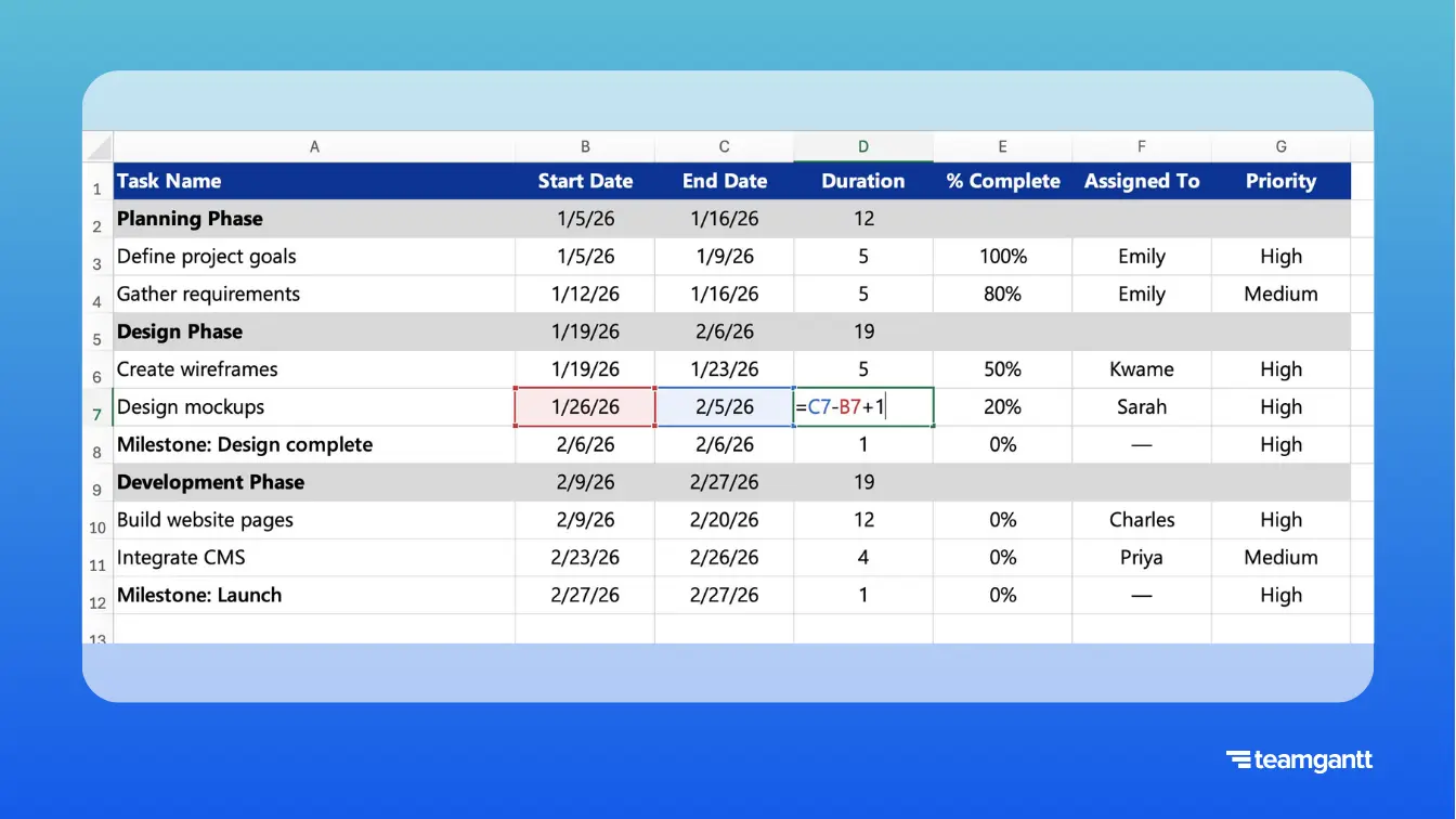
1. Set up your project data
Before you can build a Gantt chart, you’ll need to organize your project details in an Excel table. Think of this as laying the foundation. Every timeline you create will be built on these core columns.
Step 1: Structure your project table
Essential columns for Excel Gantt charts
Create a table with these 4 required columns:
- Task name: Clear, specific descriptions of each task
- Start date: When each task begins (format: MM/DD/YYYY)
- End date: When each task must be complete (format: MM/DD/YYYY)
- Duration: Number of days for each task (calculated automatically)
Optional tracking columns for advanced management
Add these columns for comprehensive project tracking:
- % Complete: Track progress on each task (0-100%)
- Assigned to: Identify responsible team members
- Priority: High, Medium, or Low indicators
- Predecessors: Tasks that must finish before others can start
- Notes: Additional details or requirements
Step 2: Organize tasks into project phases
For larger projects, it helps to group related tasks into phases. Here’s how to set them up in your table:
- Insert a row before the first task in each phase.
- Enter the phase name in the Task Name column.
- For the phase’s Start Date, use the earliest start among its tasks.
- For the phase’s End Date, use the latest finish among its tasks.
- Let Excel calculate the Duration automatically (coming in Step 3).
Step 3: Automatically calculate task duration
Now it’s time to calculate how long each task (or phase) takes.
- Click the first Duration cell (e.g., D3).
- Enter this formula: =C3-B3+1 (End Date – Start Date + 1).
- Press Enter.
- Copy the formula down the entire column.
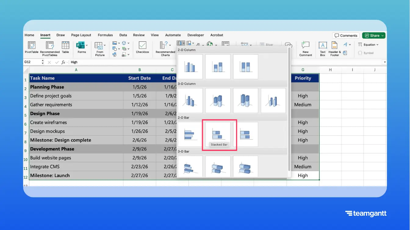
2. Build your Excel Gantt chart
Now that your data is set up, it’s time to turn it into a visual timeline.
This first chart won’t look like a Gantt yet—and that’s okay. You’re just giving Excel the raw data so you can shape it into a project timeline.
Step 1: Create the initial bar chart
- Select your entire project data table (including headers).
- Go to the Insert tab.
- Click the Column or Bar Chart button.
- Choose 2-D Bar → Stacked Bar.
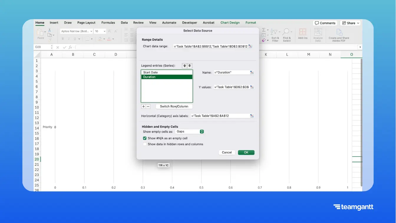
Step 2: Configure your chart data series
- Right-click anywhere on the chart and select Select Data.
- Remove any data series Excel added by default.
- Add your first series:
- Click Add.
- Series name: “Start Date.”
- Series (or Y) values: Select the Start Date column (excluding the header).
- Add your second series:
- Click Add again.
- Series name: “Duration.”
- Series (or Y) values: Select the Duration column (excluding the header).
- Set your task labels:
- In the same dialog, go to Horizontal (Category) Axis Labels.
- Click Edit (or the data range icon), then select your Task Name column (excluding the header).
- Click OK.
Step 3: Hide the Start Date bars
Right now, Excel is showing both Start Dates and Durations as bars. To make your chart look like a Gantt diagram:
- Click any of the Start Date bars (the portion of the bar on the left-hand side).
- Right-click and select Format Data Series.
- In the Format pane, set Fill → No Fill.
- Under Border, choose No Line.

Step 4: Format your chart as a timeline
Reverse the task order
- Right-click the vertical axis (task names).
- Select Format Axis.
- Check Categories in reverse order.
Convert the horizontal axis into dates
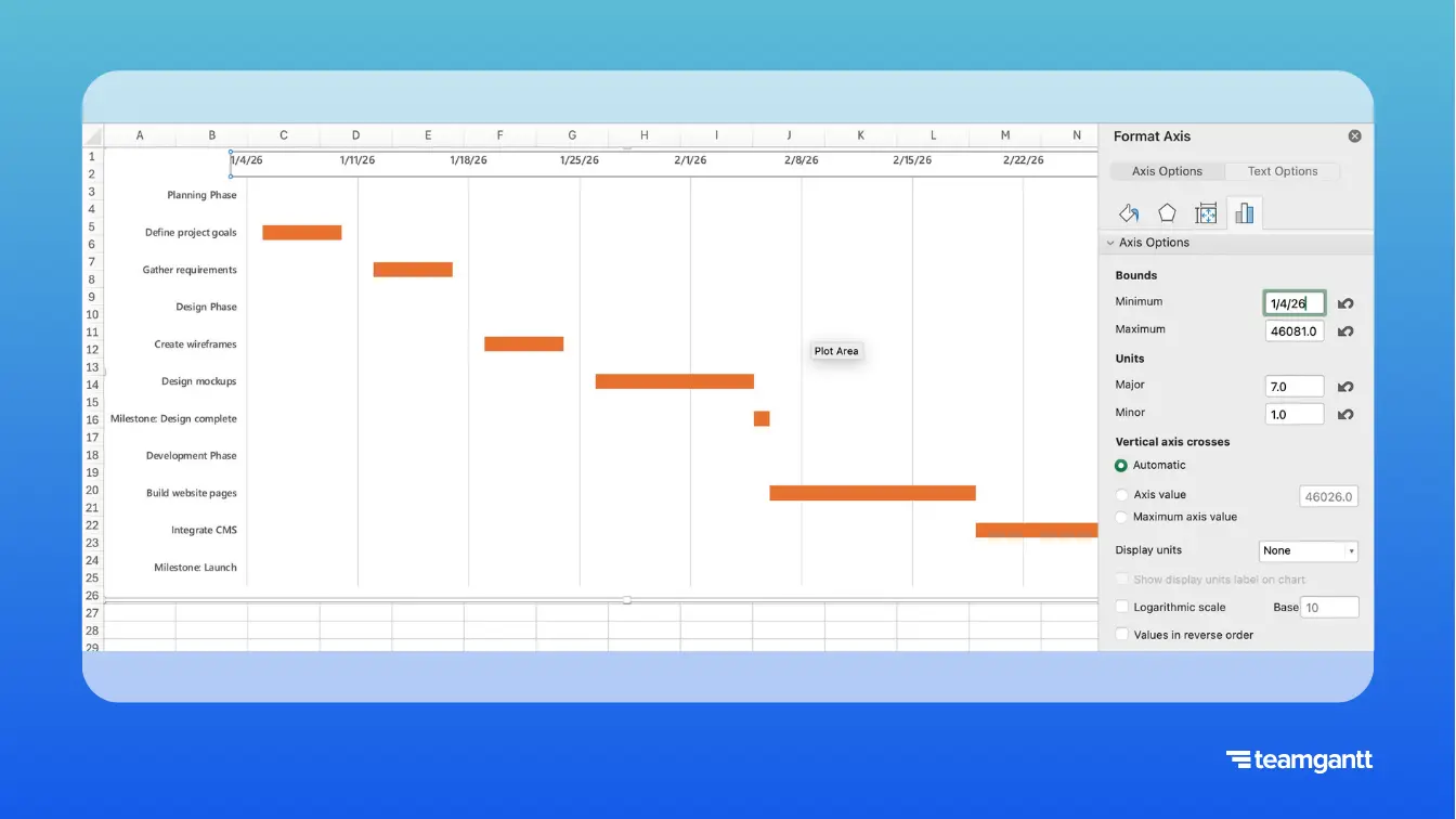
- Right-click the horizontal axis.
- Select Format Axis.
- Under Number, change the category to Date and choose your preferred format.
- Under Bounds, set:
- Minimum to the first day of the week before your project start date (e.g., Sunday).
- Maximum to the last day of the week after your project end date (e.g., Saturday).
Set your timeline intervals
- Right-click the horizontal (date) axis.
- Select Format Axis.
- Under Axis Options, adjust:
- Major unit → 7 for weekly intervals, 30 for monthly
- Minor unit → 1 for daily markers (optional)
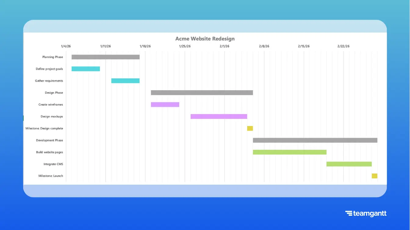
Now you have a basic Excel Gantt chart! Next, you can customize it with colors, gridlines, and milestones.
3. Format and customize your Excel Gantt chart
Once you’ve built the basic chart, formatting it makes all the difference. This step is about turning a rough bar chart into a clear, presentation-ready timeline your team can actually use.
These small touches also make your Gantt chart easier to read in meetings or when sharing updates. Not every project will need them, so feel free to pick and choose.
Add a custom chart title
Give your chart context by adding a clear title. This is especially helpful if you’ll be sharing it with others.
- Click your chart.
- Go to Chart Design → Add Chart Element → Chart Title → Above Chart.
- Click into the title box and enter your project name.
- Apply bold formatting (and adjust font size if needed) for emphasis.
Color-code tasks
Color helps people quickly distinguish between priorities, milestones, and phases without reading every label.
- Click a task bar twice (once to select the series, once more to select just that task).
- Right-click and choose Format Data Point.
- Under Fill, select Solid fill and choose your color.
- Repeat for other tasks or milestones to visually group them.
Format phase bars (optional)
If you added rows for project phases in your task table, they’ll show up on your chart just like any other task.
Fill phase bars with gray or another neutral color (or apply a subtle pattern) so they stand out. That way, they act as group dividers and don’t get confused with individual tasks.
Make task bars bolder (optional)
Adjusting the spacing between bars gives each task more visual weight. This can make your chart easier to read—especially in presentations.
- Click any Duration bar.
- Right-click and choose Format Data Series.
- Reduce the Gap Width for thicker, bolder task bars.
Add gridlines for date tracking (optional)
Gridlines can make it easier to see where tasks line up on the timeline—though on busy charts, they may feel cluttered.
- Click your chart.
- Go to Chart Design → Add Chart Element → Gridlines → Primary Major Vertical.
Add a today line (optional)
A vertical “today line” adds a real-time reference point. It’s handy for status meetings, but it does require manual updates if your timeline shifts.
- Go to Insert → Shapes → Line.
- Draw a vertical line where today falls on the timeline.
- Format it in a standout color (like red or orange).
Freeze panes for easier navigation (optional)
If your project has lots of tasks, freezing panes keeps headers visible as you scroll. For smaller projects, you can skip this step.
- Click the cell just below your headers and to the right of the task name column.
- Go to View → Freeze Panes → Freeze Panes.
4. Add advanced Gantt chart features in Excel
Once you’ve built and formatted your basic Gantt chart, you can add extra features to track progress, highlight milestones, and manage more complex projects.
These aren’t required to build a functional Gantt diagram, but they can help your chart work harder for you.
Tracking progress
Tracking progress directly in your chart gives you a visual way to see how the project is moving forward without scanning every cell.
Option 1: Add visual progress bars inside your Gantt chart
Choose this if you want progress to appear inside the Gantt bars themselves. This enables you to see how much of each task is complete versus remaining at a glance.
- Add a % Complete column to your table (if you haven’t already).
- Create 2 new columns and format them as numbers:
- Completed → =Duration * %Complete
- Remaining → =Duration - Completed
- In your chart, replace the single Duration series with both Completed and Remaining.
- Make sure your series order is: Start Date (invisible) → Completed → Remaining.
- Format the bars:
- Completed → a darker shade of your task color
- Remaining → your existing task color
Option 2: Use conditional formatting in the table
Choose this if you prefer a simpler approach that shows progress directly in the task list instead of the chart.
- Select the % Complete column.
- Go to Home → Conditional Formatting → Data Bars.
- Apply a gradient fill to show progress directly in your data.

Optional weighted % complete for group rows
If you added rows for project phases or groups, you can calculate their progress automatically with a weighted average. That way, the group’s % Complete reflects the size of its tasks, not just a simple average.
In the group row’s % Complete cell, enter a formula like this:
=SUMPRODUCT(DurationRange, PercentCompleteRange) / SUM(DurationRange)
This calculates the group’s progress based on task duration.
Creating milestones
Project milestones act as signposts on your timeline, helping your team see critical points at a glance.
- Add milestone tasks to your table with a 1-day duration.
- Change the bar color to gold so milestones stand out from other tasks.
- (Optional) Add a diamond shape for extra emphasis:
- Go to Insert → Shapes → Diamond.
- Place it on the milestone bar and group it with the chart.

Managing task dependencies (optional)
Dependencies show how tasks relate to one another. For example, Task B can’t start until Task A finishes.
Excel doesn’t handle dependencies automatically, but you can track them manually.
- Add a WBS column to your task table if you don’t already have one. This gives each task a unique identifier:
- Phases get whole numbers (e.g., 1, 2, 3).
- Tasks within a phase get decimals (e.g., 1.1, 1.2, 1.3).
- Subtasks can go another level deep (e.g., 1.1.1, 1.1.2).
- Add a Predecessor column to your task table.
- In this column, enter the WBS number of the task that must finish before the next one can start.

Building a simple project dashboard (optional)
If you’d like to track high-level stats alongside your Gantt chart, you can add a lightweight dashboard in Excel. This isn’t required to use your chart, but it can give you a quick snapshot of project progress at a glance.
Try placing these formulas above your task table or on a separate Dashboard worksheet:
- Total project duration: =MAX(EndDateColumn) - MIN(StartDateColumn) + 1
- Overall completion: =AVERAGE(PercentCompleteColumn)
- Days remaining (calendar days): =MAX(0, MAX(EndDateColumn) - TODAY())
- Tasks complete: =COUNTIF(PercentCompleteColumn,1)
- Tasks in progress: =COUNTIFS(PercentCompleteColumn,">0",PercentCompleteColumn,"<1")
- Tasks not started: =COUNTIF(PercentCompleteColumn,0)

Using dynamic ranges (optional)
Excel charts normally require you to update the data range if you add more tasks. For small projects, it’s usually easiest to do this manually.
Advanced users sometimes set up dynamic named ranges so the chart expands automatically. This involves more complex formulas like OFFSET, and it can slow Excel down on larger projects.
5. Troubleshoot common issues
Even if you follow the steps exactly, Excel can throw you curveballs. Here are some common issues and quick fixes so you don’t lose momentum.
Dates show up as numbers
Problem: Your timeline displays numbers like 44562 instead of dates.
Fix:
- Right-click the horizontal axis.
- Select Format Axis → Number.
- Change the category from Number to Date.

Task bars don’t line up with dates
Problem: Tasks appear in the wrong spot on the timeline.
Fix:
- Double-check that your axis bounds match your project’s start and end dates.
- Make sure all dates in your table are consistently formatted.
- Verify there are no text values in your date columns.
Chart doesn’t update when data changes
Problem: You update the worksheet, but the chart doesn’t reflect it.
Fix:
- Right-click your chart and select Select Data.
- Confirm the ranges include all rows.
- Check for broken references.
- Make sure calculation mode is set to Automatic.
Gantt chart won’t print correctly
Problem: Only part of the Gantt chart or task table prints, or the chart looks cut off.
Fix:
- Go to Page Layout → Print Area → Clear Print Area to reset.
- Then, reselect your full chart/table range and set a new print area: Page Layout → Print Area → Set Print Area.
- Check your page scaling: File → Print → Scaling → Fit Sheet on One Page (or Fit All Columns on One Page if your chart is wide).
Performance is slow with large projects
Problem: Excel lags when your chart has 100+ tasks.
Fix:
- Limit conditional formatting to essential cells.
- Avoid volatile formulas like NOW() or TODAY().
- Split large projects into multiple smaller charts.
Excel Gantt chart templates and resources
Building a Gantt chart from scratch can be time-consuming. Our free template gives you a head start with formatting and formulas already in place.
Free template features
- Prebuilt duration formulas
- Predecessor column for tracking task dependencies
- Professional, presentation-ready formatting
- Sample project data for reference
- Expandable table structure (supports projects up to ~100 tasks)
- Print-ready Gantt chart layout
- Dashboard with summary metrics (overall progress, task counts, days remaining)
Faster alternative—TeamGantt’s AI Gantt Chart Maker
If you’d rather skip the manual setup altogether, you can let AI do the heavy lifting. Just describe your project, and the tool builds a professional Gantt chart in seconds.
Here’s how it works:
- Fast: Type something like “Marketing campaign with planning, content creation, and launch phases over 3 months.”
- Smart: AI automatically structures tasks and dates.
- Flexible: Export to Excel or keep working in TeamGantt for advanced features.
Try TeamGantt’s AI Gantt Chart Maker for free!
When to use Excel versus Gantt chart software
Excel isn’t one-size-fits-all. The right choice depends on your project’s size, complexity, and how much collaboration your team needs.
When Excel Gantt charts work best
- Projects with fewer than 50 tasks
- Simple finish-to-start dependencies
- One-time or occasional projects
- Teams already comfortable in Excel
- Budget-conscious organizations
When to choose online project management software
- Real-time collaboration across multiple team members
- Automatic progress updates and dependency adjustments
- Complex dependency types (start-to-start, finish-to-finish)
- Resource allocation and workload balancing
- Portfolio or multi-project views
- Mobile access and automated reminders
Best practices for Excel Gantt chart success
Once your chart is up and running, a few simple habits can make the difference between a tool that feels clunky and one that actually supports your project.
Keep these tips in mind:
- Start simple: Begin with the basics before layering in advanced features. This keeps your chart easy to maintain and avoids unnecessary complexity.
- Save versions: Keep dated backups (e.g., ProjectPlan_2025-02-01.xlsx) so you can roll back if something breaks or track how your plan evolves.
- Document formulas: Add comments to any complex formulas. Future you (or your teammates) will thank you when it’s time to troubleshoot or update.
- Create templates: Once you’ve built a solid chart, save it as a template. This prevents rework and gives you a faster starting point for the next project.
- Update regularly: Set a weekly reminder to review your chart. Regular updates prevent surprises and keep your timeline aligned with reality.
- Train team members: Make sure others know how to make updates. Shared ownership reduces bottlenecks and helps everyone stay on the same page.
- Set boundaries: Recognize when Excel is no longer the right tool. If your project outgrows manual updates, it may be time to move to dedicated software.
- Test thoroughly: Check your chart with sample data before relying on it. Catching errors early helps you avoid confusion once the real project is underway.
Choose your path to project success
Creating a Gantt chart in Excel gives you complete control over your project timeline using software you already know. In this guide, you’ve learned how to:
- Set up project data
- Build and format your chart
- Add advanced features like progress tracking and dependencies
For smaller or one-off projects, Excel can be a perfectly effective solution. The skills you’ve picked up here—from basic setup to advanced customization—will help you build clear, professional-looking timelines your team can rely on.
But if you’d rather save time and get professional results instantly, TeamGantt’s AI Gantt Chart Maker can do the heavy lifting for you. Just describe your project in plain text, and AI will create a polished Gantt chart—complete with a downloadable WBS file—in seconds.
Ready to get started?
- Option 1: Download the free Excel Gantt chart template—a prebuilt file with formulas, formatting, and a dashboard so you can skip setup.
- Option 2: Try TeamGantt’s AI Gantt Chart Maker—type your project description and instantly see it mapped as a Gantt chart.
Whichever path you choose, you’re taking a smart first step toward better project planning and smoother project delivery.
Excel Gantt chart FAQs
Is there a Gantt chart template in Excel?
Excel’s template gallery does include a few simple project timeline files, but none are fully-featured, interactive Gantt charts. If you want a true Gantt chart that’s ready to use, download TeamGantt’s free Excel template and add your tasks and dates.
How do I make a weekly Gantt chart in Excel?
Right-click the horizontal axis, select Format Axis, and under Axis Options set the Major unit to 7. This displays your timeline in weekly intervals.
How do I make a monthly Gantt chart in Excel?
Follow the same steps as weekly formatting, but set the Major unit to 30. This approximates months, though exact month lengths will vary.
How do I add milestones to a Gantt chart in Excel?
Add a milestone as a separate row in your task table with a 1-day duration. Then format it differently in your chart (e.g., use a gold color or diamond shape) so it stands out. If you’d rather not build milestones from scratch, our free Excel Gantt chart template comes with milestone styles preformatted.
How do I track task progress in Excel?
Add a % Complete column to your task table. You can then overlay progress bars on your Gantt chart or use conditional formatting in the table to show status visually. If you’d prefer automatic updates, TeamGantt’s AI Gantt Chart Maker tracks progress for you as the project evolves.
Can Excel automatically adjust dependencies in a Gantt chart?
No, Excel doesn’t auto-adjust task dates when dependencies change. You can create formulas to simulate dependencies, but it’s complex and doesn’t update dynamically. For automatic scheduling and real-time adjustments, dedicated software like TeamGantt is a better fit.