Managing multiple jobs and feeling the chaos? See a simpler way to stay in control—without bloated enterprise software.
Get a personalized demo →
We’ve got everything you need to understand the basics of a waterfall chart—including why you might need it, when to use it, and how to create your own. And if you don’t have time to create your own, we’ve created a template for you!
Let’s start with the basics.
You might have heard it referred to as a “waterfall graph” or maybe a “bridge graph,” but it’s all the same. The point of the waterfall chart is to show both positive (yes!) and negative (no!) values over a period of time, while pointing out the initial and end values as well.
Whether it’s company profit, inventory, or overall sales, the waterfall chart is a useful little tool to get a quick overview and make sense of all the numbers and how things are going.
Why wouldn’t you? Everybody needs a waterfall chart in their life, right?
Okay, that might be a stretch. But if you found this page, we’re guessing you probably are in hot pursuit of a waterfall chart that will make your life much easier.
Here are a few examples of when using a waterfall chart makes sense:
We’re glad you asked. And, actually, we’re here to help.
We’ve already created a free, downloadable Excel waterfall chart template for you. Unless you want to spend 48 hours (slight exaggeration) typing numbers into a spreadsheet, then we recommend you download this beautiful little template and blow the socks off your friend and co-workers. We’ll even let you take credit for all the work!
If you’re dead set on making the waterfall chart on your own, just because you’re nerdy like that, then we get it. We’re ready to help with that too.
Whether you have a PC or a Mac, these instructions will work for you.
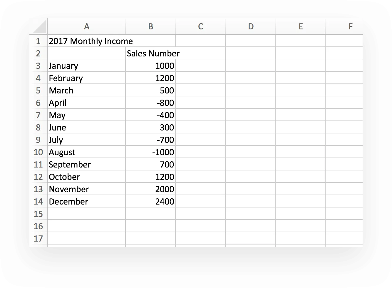
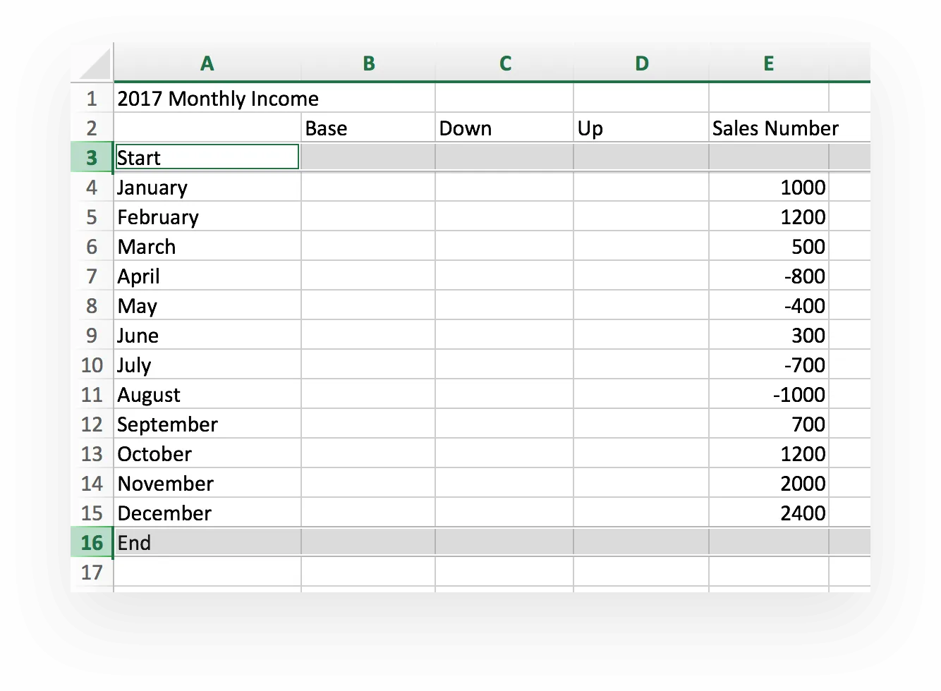
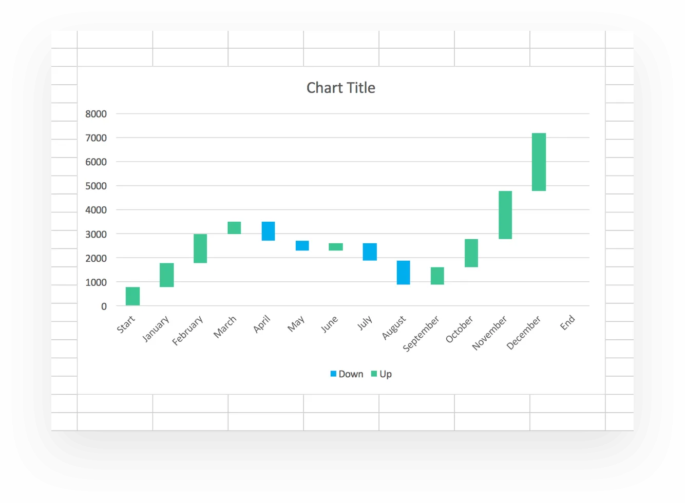
For our example, we started with something simple, monthly income. You’ll see varying numbers based on positive or negative income for each month.
Got it?
Let’s move on.
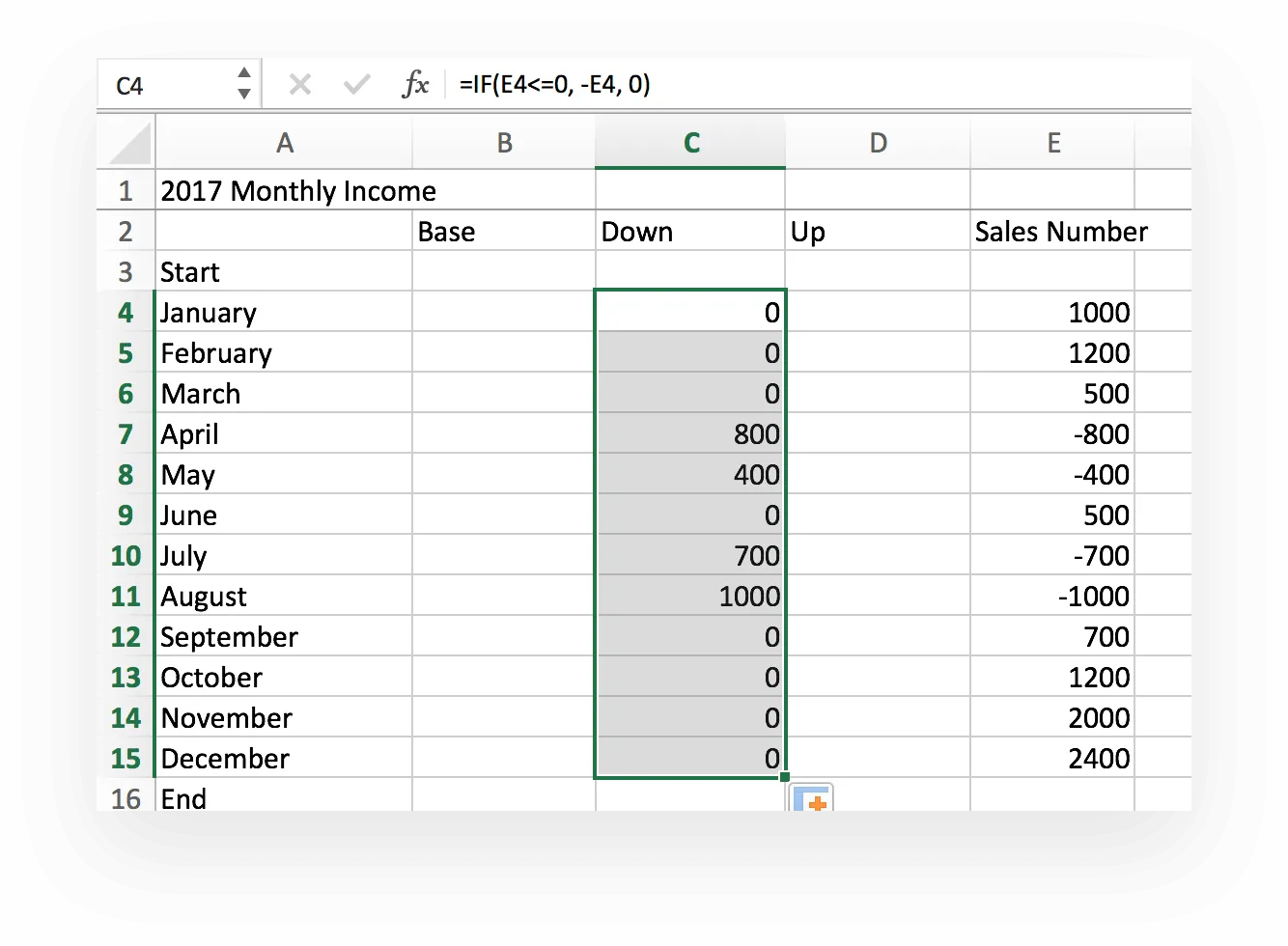
Inputting formulas into Excel might look like Greek, but it’s not that hard. Add the formulas to the first cells in each column, then use the fill tool to copy them down throughout the column.

Drag the fill tool to the end of the column to copy the formula. Your chart should now look like this:

Use the fill tool to drag the formula down to the end of the column again. Now your Excel waterfall chart should look like this. If so, well done.


Use the fill tool to drag the formula down to the bottom of the column again. And (boom!) your waterfall chart should now look like this.

Moving on…
Sounds fancy, yeah? It’s not.
But you’re going to need it.

Now you’ve got yourself a stacked chart.
Look at that! It’s got your numbers and everything. However, it’s not a waterfall chart. Not yet. Let’s make that happen, shall we?
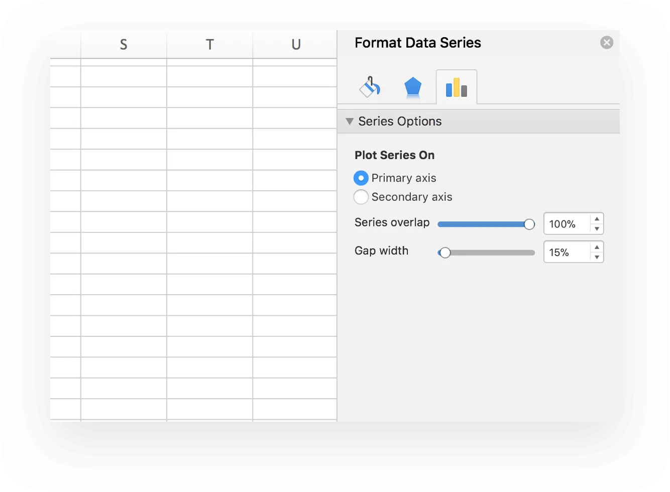
Everyone has a little room for growth, including our dear stacked chart. We’re ready to grow our stacked chart into a wonderful, well-respected waterfall chart.
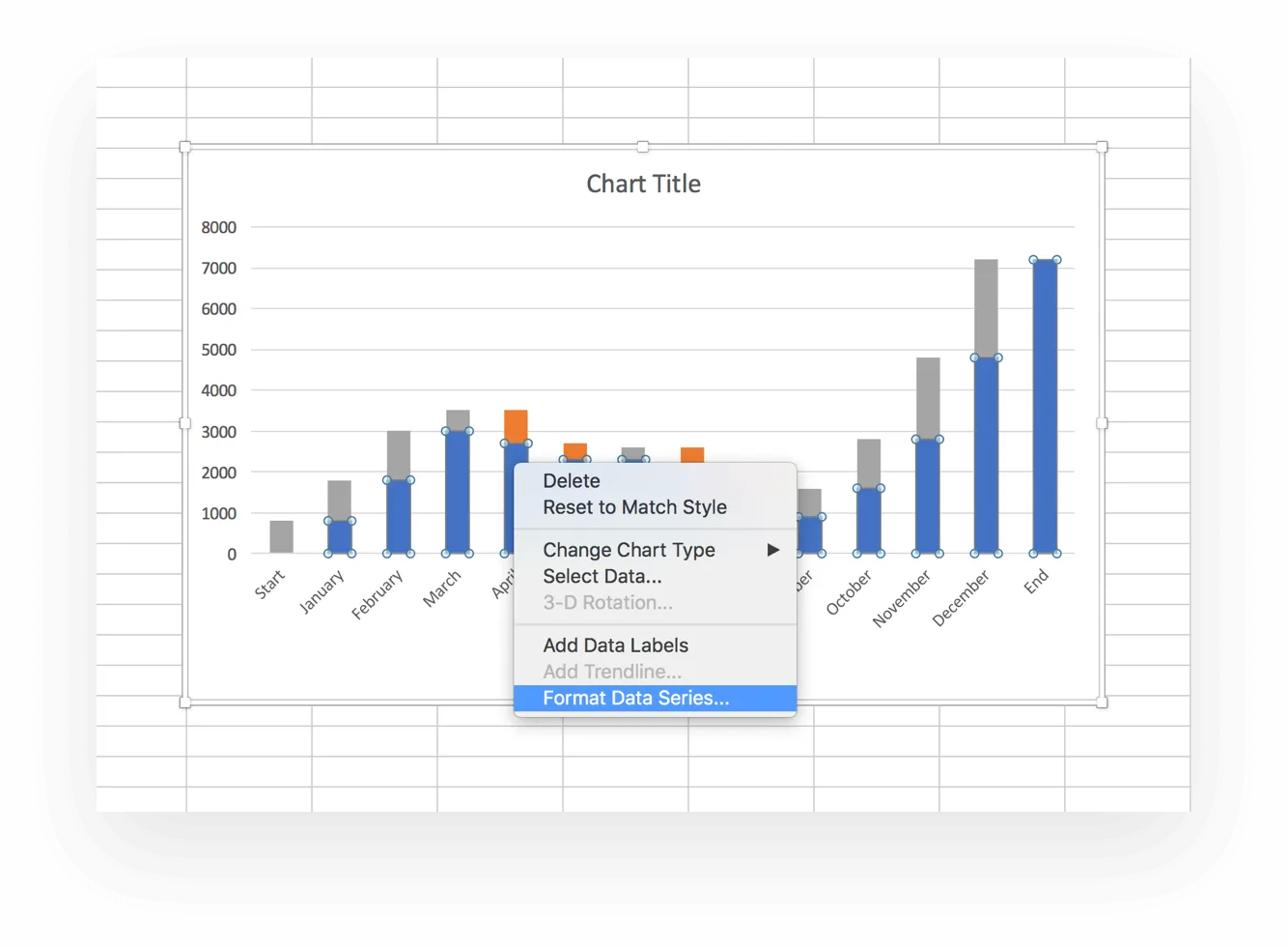
When the “Format Data Series” pops up:
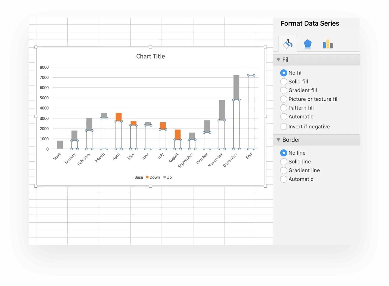
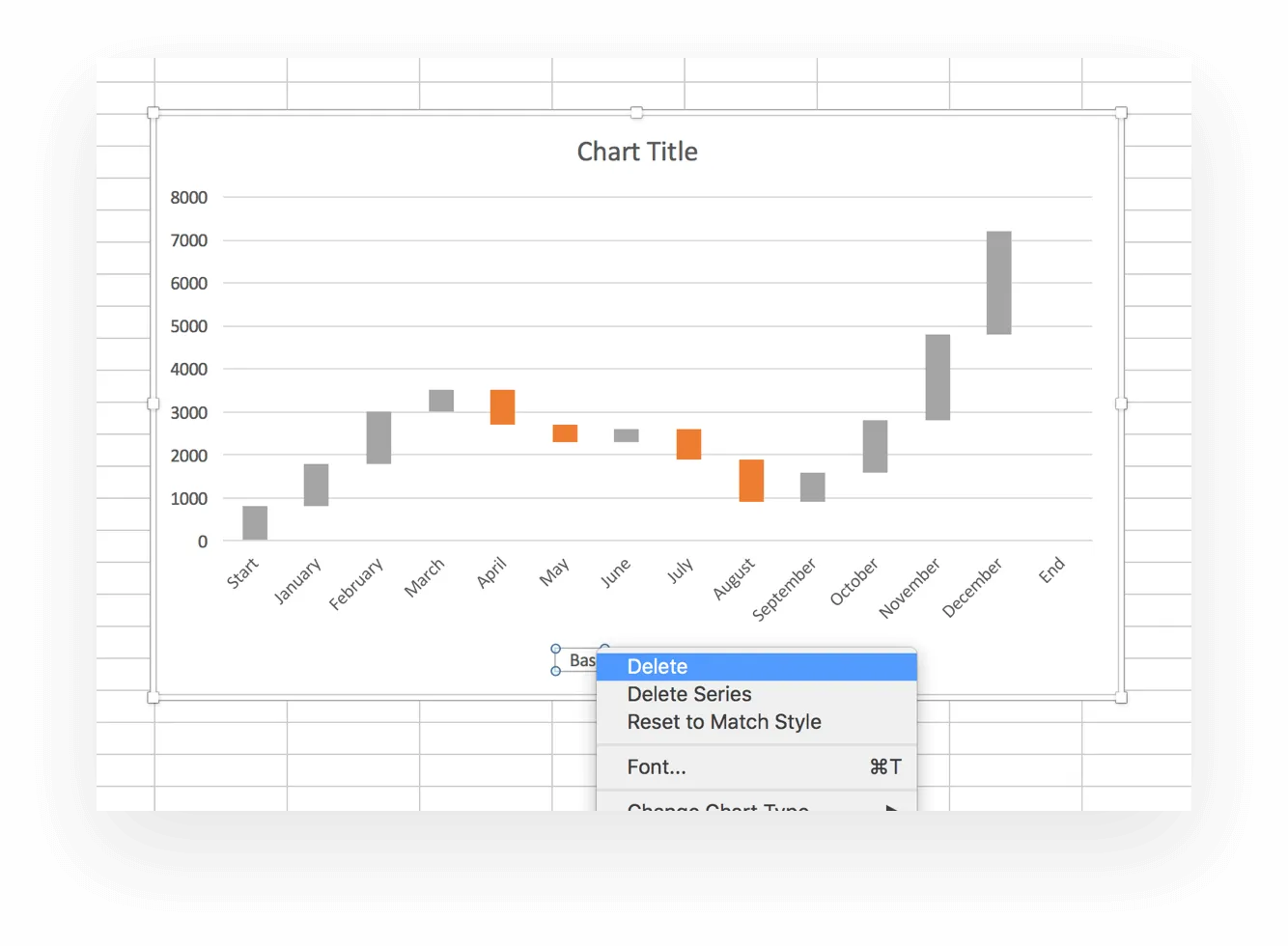
With the base section now excommunicated from our Excel waterfall chart, we can take it out of the legend.
You’ve now created a basic waterfall chart. But if you’re like us, you don’t go for basic. We’ll talk about how to make your chart pretty.
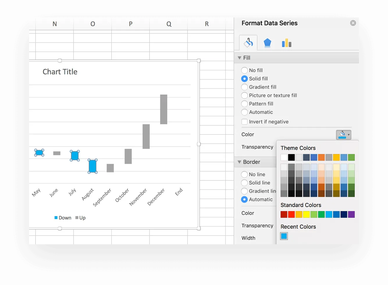
Your Excel waterfall chart’s a little drab, and you want to spice it up a bit. Maybe add some color, a few more details for context, and give it a title.
In our example above, we want to differentiate between our Up and Down columns.
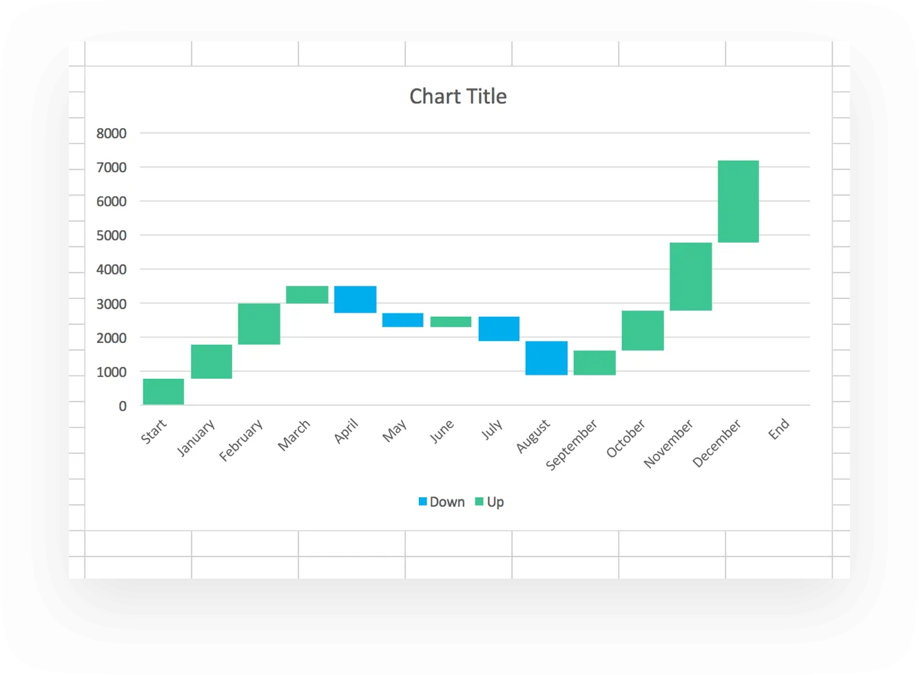
Here’s how your waterfall chart should look now.
You can also get rid of that extra white space between your columns. This will make the chart “pop” a little more.
Now you’ve got a pretty waterfall chart that should look something like this.
To add a title to your chart:
If you want to add a data label to show specific numbers for each column, you can do that. Right click on one of your columns and select “Add Data Labels” from the dropdown. Your numbers should now magically appear.
To format those labels and make them a little prettier, select one, then right click and pick “Format Data Labels” from the dropdown list.
From within that same pane, you can change the position of the label and play around with the font color and size to make the numbers easier to see. After that, you can delete zero values and, optionally, the legend from your waterfall chart.
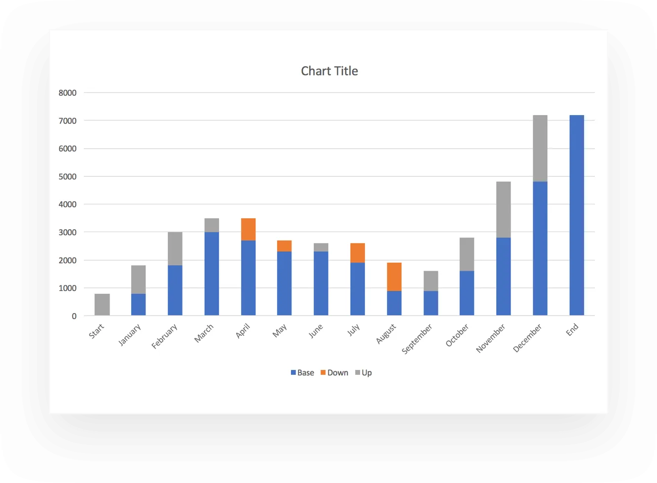
One of the great things about the waterfall report is its ability to show a starting number, the positive or negative changes, and the ending number—all in one chart.
In our example, what jumps out at you?
Our negative income months were April and May, then July and August. What is it about those late spring and late summer months that caused a dip?
Are sales down because of spring and summer vacations? Is this a normal, expected trend or something that’s new this year? If this is an expected dip, has the company made the necessary budget accommodations? And if it looks like it’s just a one-off, how can you make sure it doesn’t become a trend next year?
It also never hurts to walk any relevant team members through your chart. Seeing the data in color might make more of an impact than just sending out an email. The chart could give your sales people the kick in the pants they need to make next year better than ever!
Remember, TeamGantt is here to help. We’ve created an easy-to-use waterfall template for you. Just plug and play with your own numbers and you’ll be ready to go.
You can easily plan and communicate within your project budget by creating your own plan with TeamGantt. Get started!